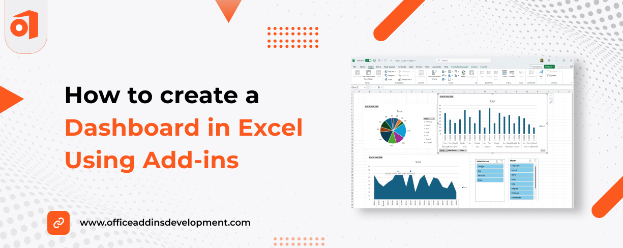
Dashboards have become an essential tool for analyzing and acting upon information in today's data-focused society. Dashboards can help teams stay aligned, make more informed decisions, and ultimately create better results.
Microsoft Excel is one of the most widely used dashboards, probably because it is well understood and widely utilized, the flexibility it affords, and the power it can be when used with some add-ins.
Excel does have some basic built-in data visualization functions; when you start to use add-ins, your dashboards can be more interactive and dynamic, they can allow for greater automation, and they can enhance the appearance of your dashboards, and you can have even more fun with your visualization.
In this blog, we’ll show you how to create a useful and usable dashboard in Microsoft Excel, emphasizing the most effective add-ins, while showing you their usefulness with respect to time savings, enabling new options, and delivering data in a more dynamic way.
Enhance document management with Word add-ins development
7 Best Add-ins for Creating a Dashboard in Excel
Before we learn how to create a dashboard, let’s see some of the best Excel add-ins that can help you have better dashboards.
1. Power BI Publisher for Excel
The Power BI Publisher add-in for Excel allows users to pin valued tables, charts, and cell ranges from Excel to Power BI dashboards. It enables users to automatically update the data when the Excel file is saved to either OneDrive or SharePoint.
Power BI Publisher add-in makes it easier for Excel users to contribute to Power BI with little to no effort to recreate visualizations. This provides an easy pathway between traditional spreadsheets and modern BI.
2. Inquire (for audit and transparency)
Inquire Add in for Excel is also known as Spreadsheet Inquire, Spreadsheet Compare, or Spreadsheet Management.
It is basically a great tool to audit and provide transparency to your dashboards. It examines the design of your workbook for broken links, hidden sheets, and formula inconsistency (this is extremely important in larger workbooks, as they can be hard to recognize when you have errors).
3. Lucidchart Diagrams
Lucidchart Diagrams work in Microsoft Excel, so you can add diagrams like flow charts, org charts, decision trees, etc., directly into your Excel file. If you are presenting a dashboard that explains a customer service workflow, you can use Lucidchart to graphically explain how all the steps are connected to each other.
4. People Graph
People graph takes raw data and presents it in a visual infographic style image using icons. For example, if you are reflecting survey results or the distribution of staff employees, the People graph can take the visual work out of displaying numbers using graphic symbols.
5. Kutools for Excel
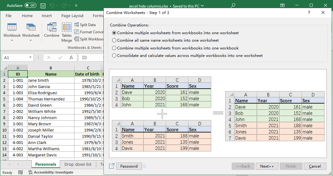
Kutools for Excel is a productivity tool. There are currently over 300 tools to help with cleaning, formatting, merging, prioritizing, and data management, along with tools to assist with repetitive tasks.
6. Zebra BI for Excel
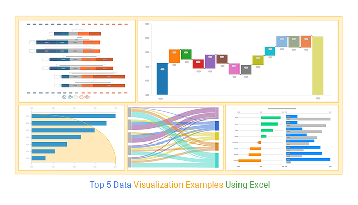
Zebra BI for Excel allows you to create professional business charts like variance, waterfall, and small multiples. These are especially useful in financial dashboards where you need to show changes in revenue, expenses, or performance KPIs over time.
7. ChartExpo for Excel
ChartExpo is an add-in that expands your Excel charting options. It offers a variety of unique chart types, helping you present your data more engagingly with minimal effort, making complex data easier to understand.
Simplify your email workflows with Outlook add-ins development
Step-by-Step Process of Creating a Dashboard in Excel Using Add-ins
Step 1: Install and Enable Add-ins
-
Click File > Get Add-ins.
Alternatively, you can click Home > Add-ins.
Search for and install the following:
- Power BI Publisher for Excel
- Inquire
- Lucidchart Diagrams
- People Graph
- Kutools for Excel
- Zebra BI for Excel
- ChartExpo for Excel
Step 2: Prepare and Clean Your Data
-
Use Kutools for Excel to
The best dashboard is built on clean data. You can have the greatest dataset, but if there is duplication, missing values, or inconsistencies in the way your data is structured, your visualizations won’t accurately represent the story. Kutools for Excel is very helpful in this step. As an example, if you are getting sales data from multiple departments that have different titles for the same column, Kutools can also help you group and align them. You may also need to split text from one column into multiple columns, remove extra spaces, and quickly convert data.
Step 3: Visualize Data Using Add-ins
Once your data is ready, the next step is to create visuals using the add-ins.
-
Power BI Publisher for Excel
With Power BI Publisher for Excel, you can pin selected Excel ranges (charts or tables) directly to your Power BI dashboard. This helps keep your reports updated in real time.
For example, if your Excel file tracks inventory levels daily, you can use Power BI to monitor those levels across multiple devices.
-
Zebra BI for Excel
Zebra BI for Excel is great for building financial dashboards. Say you want to compare monthly revenue against targets, then Zebra BI’s variance charts show where you’re over or under target with simple visuals and color coding. This is easier to understand at a glance compared to traditional bar or line charts.
-
ChartExpo for Excel
If you want to go beyond the usual chart types, try ChartExpo for Excel. It lets you create complex visuals with a simple drag-and-drop interface. For example, the use of a Sankey diagram is an excellent way to show how multiple departments might contribute to an overall process. To show the flow of resources or data, you'd use a Sankey diagram.
Why settle for basic slides? Try PowerPoint add-ins development and present with confidence.
-
People Graph
People Graph is perfect for audience-friendly visuals. For instance, if you ran a customer satisfaction survey, People Graph can turn your results into charts that use icons instead of bars, like smiley faces or people figures, making them more relatable and easier to present in meetings.
-
Lucidchart Diagrams
With Lucidchart Diagrams, you can insert flow diagrams directly into your dashboard. Suppose you are presenting a project status report; adding a flowchart to show the project phases adds helpful context next to your data visuals.
Step 4: Add Transparency and Auditability
-
Inquire
Before you consider your dashboard done, you will want to check your data to be sure it is accurate. Inquire will help with that. Inquire is a very useful tool that does three things.
It can examine your workbook and reports on broken links, circular references, and hidden cells that could affect your final results. This is particularly valuable if you’re working collaboratively and there are multiple contributors to your data source.
Read More: Best Free OneNote Add-ins to Try in 2025
Step 5: Finalize and Share
-
When you have created your visuals and ensured your data accuracy, arrange your charts, tables, and diagrams into slides using Excel's layout tools. Align your visuals and place titles or comments where necessary.
You have a couple of options for sharing your dashboard. If you saved your visuals to Power BI Publisher, you can publish your visuals to a live workspace in Power BI and then send the dashboard link to any member of your team.
You can generally also export your Excel file to PDF or share your completed dashboard file on OneDrive or SharePoint features for collaborative work if you are in a team environment. You can also copy the graphics and charts into a presentation if you are going to share them during a meeting.
Revolutionize Your Digital Notebook with OneNote add- ins development
Smarter Excel Dashboards, Better Decisions
Developing a dashboard using Excel is simple, especially when you use the right add-ins. Interestingly, add-ins can both enhance what Excel already does well and create new opportunities to manage your data. Power BI Publisher, Zebra BI, ChartExpo, Kutools, etc., allow you to clean up data, create wonderful visual representations, and add transparency.
When you integrate Excel with some powerful add-ins, you will have efficiency, speed, and clarity. These fantastic Excel add-ins are helpful for analysts, finance managers, and project leads to build dashboards that make informed decisions.
Excel Add-in development can be complex, but choosing the right add-ins doesn’t have to be. Reach out and let us guide you in the right direction.
FAQs
1. What are the benefits of using Excel add-ins for Dashboard?
Few of the benefits of using Excel Add-in for dashboards are:
- Automate repetitive tasks
- Connect with external data sources
- Enhance visuals (charts, graphs, maps)
- Make your dashboards more interactive and dynamic
- Save time and reduce errors
2. What are those common mistakes that should be avoided while creating a dashboard in Excel?
Some common mistakes to avoid while creating a dashboard in Excel are:
- Overloading with charts
- Ignoring user navigation
- Not updating data links
- Avoiding backups and version control















 Inquire