With everything changing fast, organizations are using real-time data to make informed decisions. Since there's so much information to track, just looking at numbers isn't enough. Data visualization helps people easily understand what's happening.
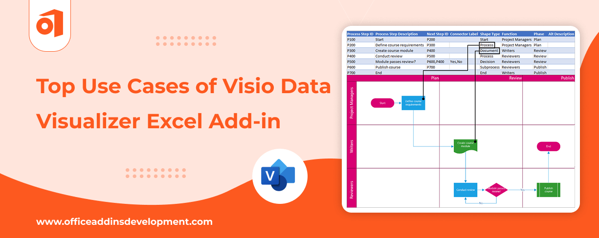
One extension that enhances Data visualization in Excel is Visio Data Visualizer Add-in. This add-in for Excel seamlessly converts data from spreadsheets into simple diagrams. And guess what? It has support for various pictorial formats.
In this blog, we’ll explore 9 impressive use cases of the Visio data visualizer add-in in Excel to help you learn its usefulness.
Manage your company data with custom Google Sheet Add-ons
9 Real-Time Use Cases of the Visio Data Visualizer Add-in
The Visio Data Visualizer Add-In in Excel empowers you to transform complex data into easy-to-understand diagrams - directly within your spreadsheet. Whether you're mapping out processes, workflows, or organizational structures, it helps you visualize data-driven insights with clarity and precision.
Given below are some of the best use cases of Visio Data visualizer Add-in:
1. Used in Mapping Business Processes
Mapping business processes is a method for graphically describing each stage of a business process from beginning to end. The Visio Data Visualizer add-in lets you create flowcharts and diagrams from the data in your Excel sheet.
Imagine working in a retail company and your team needs to document how an online order gets processed, from placing orders to delivering them.
Normally, this would take hours by manually drawing flowcharts, but with the Visio Data Visualizer add-in, you can simply enter the steps in Excel, and the diagram is created instantly.
2. IT Network and Infrastructure Planning
The Visio Data Visualizer add-in is used to create different types of diagrams, including network diagrams, floor plans, and process diagrams, without having the full Visio desktop.
Let’s say that the IT team is working on setting up a new office. They need a clear diagram of how the network cables, routers, firewalls, and servers will be connected. Creating this from scratch can be a tough process.
Using the add-in, they can enter the equipment details and how they’re connected directly into Excel. The Visio Data Visualizer then automatically creates a network diagram showing how everyone links together. This helps avoid confusion and reduces setup errors.
3. Project Timelines and Phase Charts
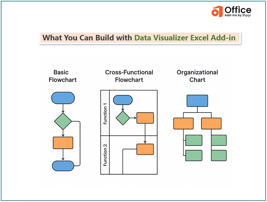
This add-in allows users to create project timelines and phase charts from Excel data without needing a separate license for Visio and for the creation of various diagrams, such as cross-functional flowcharts, swimlane charts, and organization charts, by mapping columns in Excel to shapes and connections in these diagrams.
If you’re a project manager, then timelines and phases are your best friends. Assume that the business is launching a new product. One can enter each phase, like product development, testing, marketing, and release of the product, into an Excel sheet with start and end dates.
The add-in creates a clear visual timeline showing when each task starts and ends. This helps your team stay aligned and meet deadlines.
4. Organizational Charts
The Data Visualizer for Visio is an Excel add-in that helps users create appealing organizational charts directly from their Excel workbook data, for which customization is easily possible.
An organization with 10 or 10,000 employees has a structure to be maintained on who reports to whom.
For instance, in a healthcare setting, a list of doctors, nursing staff, administrative staff, their roles, and reporting authorities can be created via Excel.This Excel list is then used by the Visio add-in to create organizational charts. This is much easier and less time-consuming, not to mention that the charts remain updated if anything changes in Excel.
5. Compliance and Audit Readiness
While it doesn't directly ensure compliance, its ability to generate diagrams from Excel data makes it easier to document and analyze information for audits. This visual representation can enhance understanding and support the audit process.
Preparing for an internal audit in a bank is a time-consuming process. One can document processes like Loan Approval, Customer KYC, or Fraud Checks in Excel, then the Visio data visualizer add-in can convert these steps into visual process flows, which can be shared with the auditors to show that everything is tracked and controlled.
Hire Office Add-ins Developers to Build industry-specific solutions
6. Communication and Collaboration
The Data Visualizer for Visio is an Excel add-in that helps people share and work together through OneDrive or SharePoint. It allows collaboration, which makes work easier as anyone from the team can review it and make the required adjustments.
When a marketing team is planning to launch a campaign, and each member is responsible for different tasks, such as content creation, design, social media, etc., then enter the data in Excel to assign roles and add the timelines.
With the help of a data visualizer add-in, all this becomes a flowchart in OneDrive or SharePoint, then anyone from the team can view and update it in real-time.
7. Incident Management and Escalation Paths
This is interesting because the Visio Data Visualizer in Excel has no incident management and escalation path-type tools, but rather it's there to draw diagrams like flowcharts from your Excel data.
Every company faces problems- be it technical issues, customer complaints, or operational problems. Handling them as soon as possible is necessary.
Suppose that the customer service team receives a complaint about a faulty product. The Excel Sheet might list steps like this:
- Step 1: Receive Complaint from Customer
- Step 2: Assign to the service team
- Step 3: Check warranty
- Step 4: Repair or replace
This escalation path can be visualized using the Visio add-in visualizer, so everyone knows what to do and when, according to the situation.
8. Customer Journey Mapping
Data-driven Visio diagrams can be directly created in Excel-based process maps and flowcharts with the Visio Data Visualizer add-in. While they're not strictly intended for customer journey mapping, the tool can be somewhat adapted by way of converting Excel tables into visualizations.
Understanding the customer's journey is important for every business. Mapping out their journey helps identify pain points and opportunities.
Ordering Pizza Over the Internet- Customer Journey Map:
A customer feels hungry and decides to have a pizza. After deciding on their pizza and customizing it, they would go to checkout, enter their address and payment details, and place the order. So, then they ate it and might go on to leave a review-which may mean that the customer will come again if it was good for them.
After opening the Visio Data Visualizer add-in in Excel, select the table, and it will be converted into a flowchart with the steps.
9. System Integration and Data Flow Diagrams
Excel's Visio Data Visualizer Add-in allows users to draw diagrams inside Excel, such as data flow and system integration diagrams, without a Visio subscription. One must have a Visio subscription to perform the advanced edits.
In software and IT companies, visualizing how data moves between systems is crucial. Data flow must be clear, whether it's between apps, servers, or databases.
Let's say your company uses a CRM, ERP, and website tracking tool, and you want to show how customer data flows between them.
With a list of systems and the direction of flow in Excel, the Visio add-in visualizer builds a diagram that developers and managers can easily understand.
Visio Data Visualizer Add-in Use cases – Wrapping up
The Visio Data Visualizer add-in for Excel makes it simpler to grasp complex data by creating clear and attractive visuals.
So instead of looking at rows of data, you can simply view the complete picture via flowcharts and visuals.
This blog has discussed the best use cases of Visio Data Visualizer Excel Addin.
Whether you're setting up a project, mapping a process, or showing data movement in your system, this one will save you time in collaborations. It's a smart and easy way to bring your Excel data to life.
Want to transform your data into impactful visuals? Get in touch with us to avail the services of Excel Add-in development, which can be customized according to your needs.
Improve your team collaboration with MS Teams Add-ins Development
FAQs on Visio Data Visualizer in Excel
1. Is a Visio license required for using the Data Visualizer?
Yes, a data visualizer needs a Visio license to use the advanced features; it can be either Visio 1 (Web version) or Visio 2 (Desktop version).
2. How is this different from using charts in Excel?
Unlike traditional Excel charts, Data Visualizer generates flowcharts and diagrams directly from your data. It's perfect for visually illustrating workflows, procedures, and hierarchies.
3. Can the diagrams be customized once they're created?
Yes, after creation, diagrams can be fully customized in Visio. You can edit shapes, styles, layout, and add or remove elements as needed to better suit your project or presentation.


 Inquire