







October 08, 2026
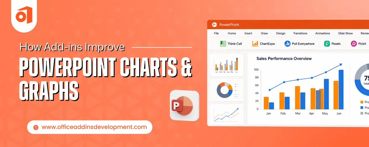
Still, your presentation lacks smart data visuals. Still, your charts & graphs look normal and less interactive. This is because your presentation is limited to in-app data visualizations.
You need to explore the advanced PowerPoint add-ins for charts and graphs available in the market. Also, you can go for custom PowerPoint add-in development to achieve your specific needs.
PowerPoint data visualization add-ins can help companies to create professional, engaging, and real-time presentations.
This blog will show you how add-ins can enhance data visualizations in Microsoft PowerPoint. Besides, it will also describe the consequences of using default visualizations, must-have PPT Add-ins to improve charts and graphs, and key functionality to look in plug-ins.
Common Problems with Default PowerPoint Charts and Graphs
Let's first look at the challenges faced while using in-app PowerPoint charts and graphs.
Develop powerful Word add-ins to automate repetitive documentation tasks efficiently.
Limited Customization
For generating basic presentations, PowerPoint provides enough functionalities, but for advanced PPTs, there is less flexibility for customization.
You can customize fonts, colors, and chart & graph types. But for customizing beyond this, such as an advanced chart type, introducing corporate branding, etc., can be difficult.
Manual data updates
If the source data changes, then the data inside charts and graphs must be updated. But without PowerPoint data visualization add-ins, changes are done manually.
Every time you need to open the chart and edit the details inside it. This can lead to human errors and can become tiresome if lots of changes are need to be made.
Time-consuming formatting
Designing and styling charts is also not easy if done manually. You have to adjust colors, fonts, spacing, labels, chart sizes, and much more on your own.
This can be a time-consuming and repetitive task if the PPT consists of multiple graphs and charts. Also, charts & graphs can look inconsistent throughout the presentation.
Lack of interactivity
Built-in PowerPoint data visualizations are less interactive. They do not have the functionality to allow performing any engaging actions like:
- Clicking on a small portion of the chart to get more information
- Filtering to highlight a specific section
- Zooming in to see more specific categories
Complex data can't be presented with detail-oriented visuals. The audience might get confused when interpreting the content.
Difficulty handling large datasets
When the amount of data is more at that time, the default PowerPoint visuals fail completely. Presenting large datasets with default visuals makes it look congested.
The visuals become unreadable, creating confusion. Looking for important trends and insights becomes difficult.
To overcome these pitfalls, use PowerPoint add-ins to improve charts and graphs with dynamic, self-explanatory, and real-time visualization features.
How Add-ins Improve PowerPoint Charts and Graphs
Spending hours creating visuals in PPTs, but still facing failures in communicating insights to the target audience. Here are some of the ways how PowerPoint add-ins for charts and graphs are used to enhance visuals.
Advanced Chart Libraries
PowerPoint data visualization add-ins provide multiple types of charts and graphs, such as Waterfall charts, Mekko charts, Range charts, Pannel charts, and many more.
Some extensions also offer chart libraries for specific departments, such as:
- Finance
- Project management
- Marketing
- Sales
These libraries give the functionality of styling charts and graphs. Due to the availability of various types of visualizations:
- Complex data can be presented clearly
- Trends and patterns become easier to find
- Correct and on-time decisions can be made
- Enhance audience understandability
Better Chart Designs
Some PowerPoint chart add-ins provide built-in templates for charts & graphs. You just have to input data into it instead of creating visuals from scratch. This helps to create diagrams with a consistent look.
Plug-ins can enhance the appearance of visuals to make PPTs more interesting. They can provide different advanced styling options, a variety of color ranges, and font types for visuals.
Automate email workflows using powerful Gmail add-in development services.
PowerPoint graph add-ins are capable of maintaining a brand’s specific styling in the charts, graphs, and tables throughout the PPT. Due to this, you don't have to adjust fonts, colors, amount of spacing, and alignments for each visual manually.
Through PPT extensions, you can generate visuals that the target audience can easily understand and analyze.
Real-Time Data Integration
PowerPoint extensions can allow data inside visuals to be directly linked with the source of that data. So when any modification is made in the source data, it gets directly updated in visuals.
External sources such as:
- Excel
- Databases
- Cloud services
- Power BI
- Web services and APIs
can be connected directly to PowerPoint.
The moment the data gets changed at its true place, the charts and graphs get automatically refreshed.
Due to live data charts in PowerPoint, no outdated information will remain in your PPTs. Also, there will be no need to perform edits manually in multiple visuals.
PPT add-ins to improve charts allows to achieve dynamic visuals in PowerPoint.
Faster Chart Creation
Through plug-ins, you can simply select any chart type and drag it anywhere into PPT. With the help of dragging, you can replace any element inside charts and graphs.
Extensions also offer reusable templates, which are one-time creation visuals. This means you just need to create it once and then use it an infinite number of times.
Additionally, libraries consisting of pre-built templates for charts & graphs are also provided by add-ins. It allows editing the templates further as per your needs.
These PowerPoint graph enhancement tools also give some time-saving shortcuts, such as:
- Generating charts with one click
- Carrying out updates simultaneously at multiple places
- Automate size adjusting
- Inputting details in graphs and charts quickly
Hence, data visualization in PowerPoint can be done very quickly through PPT add-ins, saving you lots of time.
Interactive Visualizations
PowerPoint add-ins can convert visuals from static to dynamic & interactive. Some PPT add-ins to improve graphs allow users to perform the following actions:
- Clicking portions of charts and graphs will uncover several actions to be carried out
- Applying filters to view specific information
- Explore the summarized data to the more detailed data of any portion with the help of the drill-down feature
- Description, comparison figures, or detailed calculations can be viewed by hovering over any term or area
- By clicking on any portion of charts or graphs, it is possible to navigate to the slide where the related content is present.
So, add-ins play a powerful role in generating engaging PPTs, which can be beneficial for the target audience in conveying useful insights.
Improved Data Accuracy
PowerPoint Plugins keep the data present inside visuals up-to-date by connecting directly to the original data platform. This reduces the need for manually editing the updated content in charts & graphs.
Also, due to this connection, data gets automatically imported into charts & graphs. This eliminates entering data by typing or by copy pasting.
By automatically populating and updating data into visuals, the probability of human error reduces. There can be no missing, incorrect, or incomplete data.
Error-free charts and graphs allow you to make decisions on time without doubting the accuracy of data.
Popular Add-ins for PowerPoint Data Visualization
There are several varieties of PowerPoint add-ins available today. It is obvious to get confused while choosing any one out of these. Let’s explore some of the best PowerPoint add-ins for data visualization that might give you clarity about their features.
Think-cell
Think-cell is the best solution to create professional and self-presenting charts & graphs for presentations. It can provide the following functionalities:
- A large range of chart and graph types
- Allows embedding Excel sheet data
- Interactive Dashboards
- Auto-population of data into visuals
It provides free access to students only. For professional or corporate users, it still asks for a subscription.
Simplify reporting and analytics with advanced Google Sheets add-in development
Office Timeline
Office Timeline is known for generating:
- Timelines
- Roadmaps
- Gantt charts
- Project schedules
- Program planning visuals
into the presentations. Project managers find it useful for tracking the progress and status of the project. It provides the flexibility to create a timeline by drag and drop. It also allows integration with Excel and some project management platforms. These make it stand out from other PowerPoint add-ins for charts and graphs.
Zebra BI
Zebra BI can convert complex data into more understandable and easier-to-interpret presentations. It is capable of creating powerful visualizations for delivering meaningful insights to the audience.
Popular features include:
- Advanced charts for business purposes
- Additional tools for interactivity
- Provides automated variability measurements
- Better collaboration options
It is one of the recognized PowerPoint Chart Add-ins, as it follows the International Business Communication Standards (IBCS) for standardized reporting and presentations.
It comes with a free version, but for advanced features, it asks for monetization.
DataPoint
Users whose data gets updated frequently are most likely to adopt this PowerPoint Plugin. As it is the best extension for developing real-time visuals, live reports, and auto-updating dashboards.
DataPoint generally comes with the following capabilities:
- Condition-based visibility control on slides
- Automate PPT generation and distribution to the team or clients
- Set formatting based on the situation or condition
- Schedule refresh for the PPTs
One of the well-known use cases of datapoint is digital signage displays. It comes with only paid versions, including license purchasing or subscription plans.
STC AI
STC AI helps to generate engaging data visuals without requiring high-level experience in design. It seems to have a low learning curve compared to other PowerPoint Graph Add-ins.
STC AI Key features involve:
- Prebuilt Templates for better storytelling
- Dynamic corporate branding tools
- Exclusive Interactivity options
- Support modern chart types
This tool can continue running even in offline mode. But for installing and updating purposes, the internet is required. Moreover, it is completely free to use.
Features to Look for in Visualization Add-ins
Now, let's learn about important features to consider while choosing any add-ins for Data visualization in PowerPoint:
Live data connectivity
To keep data inside visuals up-to-date, live data connectivity is essential. It connects visual data with external sources.
Because of this, visuals get auto-populated and get updated automatically. This improves accuracy and saves lots of time in generating PPTs.
Boost productivity with custom Visio add-ins tailored to business requirements.
Advanced chart library
Default PowerPoint charts and graphs aren’t able to present complex, large datasets. They usually fail to provide a clear and consistent look throughout the PPT.
PowerPoint add-ins for graphs should provide a large variety of chart and graph types. Plugins supporting advanced visuals can enhance analysis and decision-making.
Dashboard support
Through dashboards, multiple charts and graphs can be presented to achieve a one-picture of the entire demographics. It basically helps to connect each visuals for reaching at one conclusion.
So, PPT Add-ins for graphical data without dashboard support will face struggles in decoding the link between each scattered visual.
AI-powered insights
PowerPoint infographic add-ins with the facility of AI-powered insights can automatically uncover the trends, patterns, or insights by analyzing visuals.
Due to this, even a less experienced person can easily extract insights. Also, you don’t need to spend hours to derive insights.
Automated Chart Formatting
Styling and designing of visualizations also matter the most for delivering the important insights to the audience. But manual formatting consumes lots of time and energy.
Automatic adjustment of space, dimensions, fonts, and themes will help in enhancing your presentation's appearance. So, extensions with automated formatting functionality can be game-changing for you.
Final Thoughts on PowerPoint Visualization Add-ins
In the end, charts and graphs not only show numeric values but also tell a story hidden behind them. PowerPoint add-ins enhance this visual storytelling in presentations to another level.
These plugins can generate professional, data-driven, and self-presenting visuals instantly. With AI support, add-ins can even help to discover the trends and patterns that are hard to identify. Using PPT add-ins for smart presentations allows you to generate interactive and easy-to-interpret slides.
Selecting the correct PowerPoint add-ins will contribute to the fast and accurate generation of presentations. Besides, it will not allow the audience to lose interest till last slide.
FAQs
1. Do Microsoft PowerPoint add-ins need an active internet connection to function?
Some add-ins can function without an internet connection, but it usually depends on their functionality.
An internet connection will be required for an add-in to:
- Connect PowerPoint with external sources
- Integrate PowerPoint with cloud platforms
- Install and update it
- Use AI services linked to it
2. Does installing add-ins slow down the operation of PowerPoint?
Installing add-ins does not always affect the operation of PowerPoint, but in some cases, you might feel this. If install add-ins are lightweight (the one which uses less system resources), then it will not create much difference.
3. Can PowerPoint add-ins reduce the workload?
Yes. It definitely reduces workload by automating chart creation, reducing manual updates, saving formatting time, and providing reusable templates.
4. Do PowerPoint add-ins improve collaboration?
Yes, collaboration-focused add-ins help teams maintain shared templates, standardized reporting, consistent branding, and centralized visualization libraries when multiple users work on presentations.

Kapil Panchal
A passionate Technical writer and an SEO freak working as a Content Development Manager at iFour Technolab, USA. With extensive experience in IT, Services, and Product sectors, I relish writing about technology and love sharing exceptional insights on various platforms. I believe in constant learning and am passionate about being better every day.


 Benefits of Using Microsoft Graph with Outlook Add-ins
October 08, 2026
 12 Red Flags When Hiring an Office Add-in Development Company
October 05, 2026

 15 Best AI Email Assistants Worth Trying in 2026
July 07, 2026
 Top CRM Add-ins for Microsoft Outlook
June 23, 2026





 Say Hello
 Inquire